Tableau's Viz of the Day from January 14 2016, Premier League 2015/2016 Shot on Target xG Dashboard, provides an in-depth look into The Premier League, as it pertains to shots on goal, goals, and... Expected goals? The "advanced stats" crowd strikes again. To be honest, I had no idea what xG stood for before I Googled it after a few hours of actually working on this blog post. Fortunately, you don't have to be an expert on advanced stats to understand this data visualization.
 |
 |
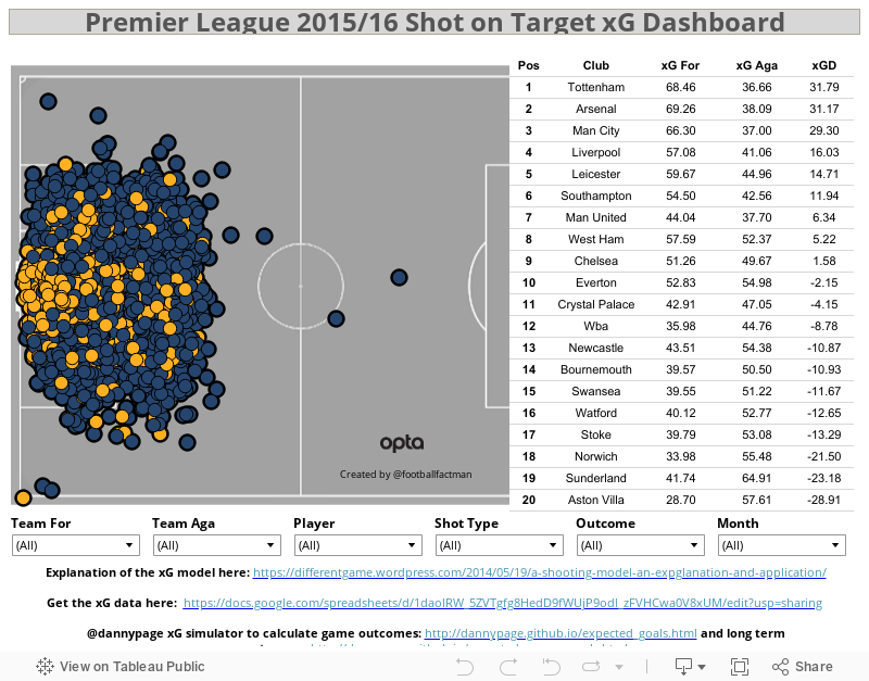
The obvious strength of this data visualization is the fact that it has every shot on goal, goal, and the advanced statistics for each player and team from the current Premier League season, and showcases it all in an effective and interactive way, all while staying up-to-date with the current fixtures. At first glance, this chart just looks like one big mess full of bubbles that would drive people like Chad Skelton crazy. However, once it is broken down into categories such as Team For, Player, or Shot Type, the once overwhelming and overcrowded mass of bubbles becomes an extremely effective and interactive tool for Premier League enthusiasts. The other categories you can choose from are Team Aga(inst), Outcome, and Month. The chart and the six drop-down lists are extremely simple to use. By mixing and matching the various lists, the bubbles become whittled down and the chart thus becomes not only much more visually pleasing, but easier to understand as well. Other strengths are that you can highlight any area of the pitch to see shots from a specific area, you can zoom in to see exactly where each shot is, and you can hover over any shot and see the stats about it--who shot it, the xG, the outcome, and more.


 The chart on the right doesn't correlate with the actual shot chart when you click on any of the options. You can Keep Only or Exclude any category, Club, xG For, xG Aga, or xGD, but the shot chart stays intact. The chart should reflect whatever is clicked, just as it does with the drop-down lists at the bottom. The circles are all the same size--goals could be larger than the non-goals, or the velocity of the shot could be added and the circle-size would be based on the speed of the shot. More colours could be added as well, perhaps having each shot colour-coded with their team, as that would liven the chart up a little and add some more fun to it. There could also be more options added for Shot Type, such as whether it was a strike, volley, or header, and what foot it was shot with.
This Premier League shot chart is as good as it gets when it comes to data visualization. It explains most of the detail clearly, and is extremely simple to use. Even if you're like me and know next to nothing about fancy stats, this data visualization is still very informative.
I idea the chart is trying to explain seems very overwhelming and after it starts to make sense. While not knowing about soccer, I can still can get a general sense of what I am doing and what some of the information mean. For a soccer fanatic this might be super fascinating.
ReplyDeleteNot knowing soccer it seems overwhelming, and would deter me under different circumstances. It is really informative, and interesting to work through. The interactive portion is crucial to the experience, and is obviously targeted at an audience familiar with the sport.
ReplyDeleteThis visual data is very thorough. It contains all shots on goal from one diagram. If you are a fan of any EPL teams, you can set the short data by individual teams. However, seeing all shot data in one diagram may overwhelm those who don't understand English football.
ReplyDelete