Monday, February 29, 2016

Sunday, February 28, 2016
Data update 2: innovative website helps find missing animals
Opening lead sentence:
More lost animals in Vancouver have been found and matched ever since the BC SPCA launched their innovative online lost and found website in 2012.
Here is the raw data and a small slice from the data:
The spreadsheet shows all lost animals in the city of Vancouver since the year 1999, and is still being updated in 2016 (Note that the years 2007-2011 are incomplete). Since those five years are incomplete, I decided to start at 2012, and lo and behold, I was able to find an article that related directly to the year 2012 (I literally spent all week trying to find an article that would add additional context to any aspect of the spreadsheet whatsoever, as well as figure out what to include in the slice, and was actually freaking out that I wouldn't find an article or figure out a slice and would have to change databases, but thankfully it all worked out in the end). The slice contains the number of animals that were lost in 2012 up until mid-February of 2016, and categorizes them into found, lost, and matched columns. Using these numbers, I calculated the percentage of found and matched animals, and each year's percentage was higher than 2012's.
Here is the original dataset:
Here is a news story that relates to the data:
This article is about the then new online lost and found website the BC SPCA launched in January of 2012. It outlines some of the key features of the website, such as the public being able to post their own photos and descriptions of lost and found animals directly on the website. This article is relevant to my data because ever since the website was launched in 2012, the percentage of lost animals being found and matched has gone up and has not been lower than the 2012 percentage. It is safe to say that the launch of the BC SPCA lost and found website has factored into more lost animals being found and matched over the past few years.
Monday, February 1, 2016
Sunday, January 31, 2016
Data update 1: animal lost and found
1. What dataset will you use for your final report?
The dataset I will use for my final report is Animal Control Inventory (Lost and Found) and it can be found on the City of Vancouver website.
2. Describe the dataset. What kind of data does it contain?
This dataset contains information on all animals that have been reported lost in the city of Vancouver since 1999. It contains the "Date" that the animal was lost on, the "Color" (it should be 'colour', we're in Canada) of the animal, the "Breed," type of animal or best fit breed description, the "Sex" of the animal, the "State" of the animal, whether it was found, lost, or matched, the "Name" of the animal, and the date that it was recorded in this spreadsheet. The dataset is very simple to understand and navigate, and provides a very detailed account of reported lost animals in Vancouver.
3. Is there anything about your dataset that you don't understand? (i.e. what a column heading means). How will you find this out?
There isn't anything about this dataset that I don't understand. All of the data is very straightforward and easy to understand.
4. What are some questions you hope to answer with your data? List at least three. (you don't need the answers at this point)
Some questions I hope to answer with this data are: "What is the most common animal breed that has gone missing?"
"What month do the most animals go missing?"
"What year has had the highest number of missing animals since 1999?"
"Has the rate of missing animals gone up or down over recent years?"
The dataset I will use for my final report is Animal Control Inventory (Lost and Found) and it can be found on the City of Vancouver website.
2. Describe the dataset. What kind of data does it contain?
This dataset contains information on all animals that have been reported lost in the city of Vancouver since 1999. It contains the "Date" that the animal was lost on, the "Color" (it should be 'colour', we're in Canada) of the animal, the "Breed," type of animal or best fit breed description, the "Sex" of the animal, the "State" of the animal, whether it was found, lost, or matched, the "Name" of the animal, and the date that it was recorded in this spreadsheet. The dataset is very simple to understand and navigate, and provides a very detailed account of reported lost animals in Vancouver.
3. Is there anything about your dataset that you don't understand? (i.e. what a column heading means). How will you find this out?
There isn't anything about this dataset that I don't understand. All of the data is very straightforward and easy to understand.
4. What are some questions you hope to answer with your data? List at least three. (you don't need the answers at this point)
Some questions I hope to answer with this data are: "What is the most common animal breed that has gone missing?"
"What month do the most animals go missing?"
"What year has had the highest number of missing animals since 1999?"
"Has the rate of missing animals gone up or down over recent years?"
Sunday, January 17, 2016
More shots on the pitch than at a British pub
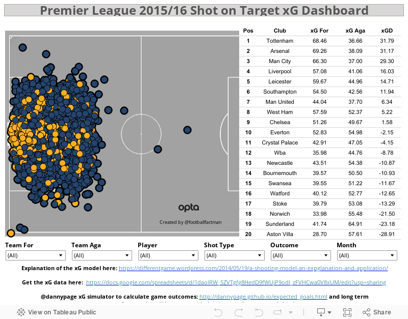
Tableau's Viz of the Day from January 14 2016, Premier League 2015/2016 Shot on Target xG Dashboard, provides an in-depth look into The Premier League, as it pertains to shots on goal, goals, and... Expected goals? The "advanced stats" crowd strikes again. To be honest, I had no idea what xG stood for before I Googled it after a few hours of actually working on this blog post. Fortunately, you don't have to be an expert on advanced stats to understand this data visualization.
 |
 |
The obvious strength of this data visualization is the fact that it has every shot on goal, goal, and the advanced statistics for each player and team from the current Premier League season, and showcases it all in an effective and interactive way, all while staying up-to-date with the current fixtures. At first glance, this chart just looks like one big mess full of bubbles that would drive people like Chad Skelton crazy. However, once it is broken down into categories such as Team For, Player, or Shot Type, the once overwhelming and overcrowded mass of bubbles becomes an extremely effective and interactive tool for Premier League enthusiasts. The other categories you can choose from are Team Aga(inst), Outcome, and Month. The chart and the six drop-down lists are extremely simple to use. By mixing and matching the various lists, the bubbles become whittled down and the chart thus becomes not only much more visually pleasing, but easier to understand as well. Other strengths are that you can highlight any area of the pitch to see shots from a specific area, you can zoom in to see exactly where each shot is, and you can hover over any shot and see the stats about it--who shot it, the xG, the outcome, and more.


 The chart on the right doesn't correlate with the actual shot chart when you click on any of the options. You can Keep Only or Exclude any category, Club, xG For, xG Aga, or xGD, but the shot chart stays intact. The chart should reflect whatever is clicked, just as it does with the drop-down lists at the bottom. The circles are all the same size--goals could be larger than the non-goals, or the velocity of the shot could be added and the circle-size would be based on the speed of the shot. More colours could be added as well, perhaps having each shot colour-coded with their team, as that would liven the chart up a little and add some more fun to it. There could also be more options added for Shot Type, such as whether it was a strike, volley, or header, and what foot it was shot with.
This Premier League shot chart is as good as it gets when it comes to data visualization. It explains most of the detail clearly, and is extremely simple to use. Even if you're like me and know next to nothing about fancy stats, this data visualization is still very informative.
Subscribe to:
Posts (Atom)